skip to main |
skip to sidebar


While going through my research all over again and looking for different ways to communicate my ideas and present my findings, I noticed that I had made quite extensive research on letter form distortion and alterations,which I thoroughly ignored as the project moved on.Now I decided that they should also be included in some way,especially since my kaleidoscopic typeface is based on such distortion.
Having in mind that the kaleidoscope is basically a tube of mirrors, through which a reflected image is produced, I wanted to explore all types of reflection that a mirror could provide by using letters instead of images.My previous kaleidoscopic typeface experiments have been done by using a teleidoscope. Unlike other kaleidoscopes, teleidoscopes have a lens and an open view.In that way they can be used to form kaleidoscopic patterns from objects outside the instrument, rather than from items installed as part of it. Depending on the number and composition of the mirrors the lenses differ, so does the patterns produced as well.After obtaining a pattern composition from 3 type of kaleidoscopic lenses, I decided to try a method of reflection that is less complicated by using a single mirroring surface.However, I was not interested in mirroring whole letter forms so I used the mirror to position it within the form,on one its two axis. At first, I divided each letter into four quadrants and using a mirror developed 4 variations of the typeface by reflecting two quadrants at a time.
Visually, I was very pleased with the results because depending on the type of reflection and which two quadrants were reflected, the four specimens produced were quite different and at the same time shared common features.They also ended up having the roundness of completely new and usable typefaces that seriously challenged legibility and in a way presented the level of mirroring generally used in typography. Due to this use of mirroring of characters in some typefaces (like 'd' and 'b' , 'p' and 'q') people with dyslexic problems experience great difficulties in reading.Is this condition prompted in any way from the long exposure to such typefaces?
Used in order to simplify alphabetic codes,mirroring sometimes can have negative effects if it continues as a trend. This is evident through my mirroring typeface where nearly 80% of the letters are still recognisable or resemble other characters after the alteration.This piece shows what the prospect could be if we go too far with this simplistic approach to type.
I started having doubts if the physical format is really going to work for my concept, since I could not get the required feedback from children that I needed to support it.This resulted into lack of conclusion of my investigative project.I knew I could not base my whole FMP on an idea that I was not able to test.Thus, I started looking for new way to communicate the ideas that I have been exploring by going back to the stage of my initial research and making new connections between the findings.The re-discovery of my research content led me to the decision to try video format,as an alternative and more direct way of communication.I wanted to use the distorted typefaces and show the intricate patterns that the rotation of the kaleidoscopic lenses produced.This effect is quite stunning since it can practically transform even an everyday object into a visually intriguing piece.Being fascinated by this effect, I took short videos (40 sec.) of each (Arial) letter, viewed through three types of kaleidoscopic lenses.This provided me with a number of video files which I was not sure how to use.Then, after visiting the Science Museum once more I found a gripping work that resonated with the new direction into which I was heading. The lightening post http://www.youtube.com/watch?v=t2J86v9l5n0&feature=related .It basically portrays moving streams of real-time text samples from public chat rooms with sound.This piece of media art really made a huge impression on me, especially with the amount of research that is involved in it and the visual qualities of the final outcome. That's why I started to consider the video format as a possible medium which will allow me that directness.
Another method which came to my mind at that time was a bit unclear but involved a direct interaction and game-base design of my video files.Which meant, creating a quiz-type of diagnostic tool for people with learning and perceptual difficulties.This idea, in my opinion, was working better with my initial concept for this project but it faced me once again with the inability to test it in practice.
..... sample video files


 When it came to choosing the colours for the sand forms I turned to my research on Wassily Kandinsky theory about the universal correspondence between the three primary colours and the three basic shapes ('...the dynamic triangle is inherently yellow,the static square is intrinsically red, and the serene circle is naturally blue')Reaching to this idea through his own experimentation he also circulated a questionnaire at the Bauhaus,asking participants to fill in blank triangle,square and circle with one of the three primary colours.With this attempt he wanted to discover a universal subconscious connection between these forms and colours.However,Kandinsky's theory was dismissed by some members of the Bauhaus as 'utopian aestheticism'. While checking the validity of this statement I found a very interesting experiment based on the same notion in 'The ABC's of triangle,square and circle:The Bauhaus and Design Theory' by E.Lupton and J.Miller.It represented different takes on the same problem that Kandinsky posed when trying to prove the universal correspondence between forms and clours.
With this in mind, I decided to carry out the same experiment that Kandinsky did in order to formulate his thesis.My aim was to challenge his principle rather than confirm it.Assuming that a theory that dated back to 1923 could no longer be applied these days,especially when it comes to children.I expected to get quite different response from them.This expectation was based on two reasons:firstly,the fact that Kandinsky's theory seems very convincing to people only because of its consistency and systematic explanation,and secondly,I thought that the children wouldn't apply the same level of logic when colouring forms and will produce a wide variety of interpretations.
After a lot of struggle to get access to children,in order to carry out this simple colouring experiment I got permission to do it. Equipped with several packs of crayons and a pile of paper I visited 'One O'clock Club' in Peckham Rye.The age group that I targeted was form 2 to 4-year-olds.The responses I got,however, were shocking.More then half of the children that took part in the experiment (3/5)associated the forms with the colours in the same way that Kandinsky proposed.This revelation determined my decision on which colours I was going to use for the sand forms.Then the next step was to decide on the colour of each letter.I did so by simply matching the general form of the letter to one of the basic forms.Once I finished with this I started the actual vacumforming process,which resulted with several tiles of relief distorted letter forms.I quite likes the tiles with the letters and I started to question myself if I should cut the excess plastic or leave parts of it.Strangely, the letter blocks reminded me of mosaic tiles and I started imagining them as a material that is suitable for both covering nursery walls or as a part of playgrounds.This method of physicality in presenting information and its application to the surroundings are very appealing to me because it combines product and information design,it's more environmentally friendly and tactile.


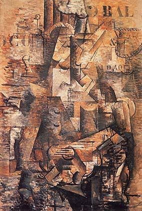
In a search for a different view points I came across some kaleidoscopes in the Science Museum.They were quite fascinating to look through since the distortion pattern of each one was different and even the same images seemed vastly different when seen through them.Again I thought it is a commonly used tool for creating seductive visual forms,not usually associated with type.The segmented structure of the lens reminded me of the eye structure of the insects.This brought me back to my research about the physical process of seeing and I found a really good piece of writing about the similarities between the human eye and the camera.It dealt not only with scientific facts but also had a brief description of the effects of the camera invention on the arts.Allowing us to see things from multiple and new angles,the invention of the camera had significant impact on Cubism and Futurism.In fact,If you have ever spend sufficient time in front of a cubist painting you might have caught yourself trying to figure out the logic behind its segmentation.At least this is what I do each time when faced with these type of pieces.Even though,the Cubist painters explored the process of looking at objects and creating images simultaneously from multiple points of view, they never wanted to deal with text.One of the first cubist painting on which text can benfound is Braque's painting 'The Portuguese' (1911) http://i20.photobucket.com/albums/b230/exuberantfool/theportuguese.jpg where you can see the stencil-like flat signage the top right corner.
Inevitably, this made me wonder why the mobility of the human eye through the camera had made such an impact and the notion of the segmented vision of the insects did not.And why all these events are reflected in fine arts and hardly used in typography? For that reason,I decided to test a couple of different kaleidoscopes.I wanted to see and capture the distortion they created to typefaces and see to what extend legibility can be challenged in that way.This experiment provided me with a wide range of visual samples because even the slightest change of angle or distance created new forms and shapes of the most common typeface that I used - Arial. I wanted to capture the very delicate and stunning play of these patterns so I attached the kaleidoscopic lens to my camera.This allowed me to capture and print on paper an image which probably no one will ever see in the same way as me ( since the same positioning,light and distance have to be achieved)By combining the kaleidoscope and the camera I was able to look at things with the mobility of the human eye and the segmentation of the insects' eye.It was amazing to observe how an abstract and seemingly meaningless image can be transformed in seconds into a solid form which is a part of structured communication system.(which is a bit like the way I see cubist works)


 Basing my research on the well-structured plan of 'Visual Grammar' I began also to took into the logic of letter characters building and the already existing alternative uses of letter forms.This included research into the way Braille alphabet, Moontype, Binary codes and Unicode work (computer industry standard of representing text on screen).
(braille generator: http://byronknoll.googlepages.com/braille ,
moontype generator: http://byronknoll.googlepages.com/moon
binary code alphabet: http://www.teach-ict.com/gcse/hardware/bits_and_bytes/alphabet_binarycode.htm
This gave me a broader view into the almost mathematically systematic ways of building a set of characters.
After getting acquainted with the difficulties that some people experience reading (because of medical problems) I started to think of the alphabetic characters as a set of communication devices based on logic and simplicity.So I reached the conclusion that these are the most important things about building new forms of such devices,especially if you want them to be widespread and used.The level of logic should be at a basic and their visual qualities should be familiar to the users.
I also kept experimenting with different visual manipulations to challenge the legibility and the set rules of typeface design so far.However,even in the chaos there could be found order.I decided to use the idea of secretly implied order into the process of generating new forms and made use of one of the most simple and ingenious devices that designers use:the grid.Arranging letters on a grid seems like a dull test but the trick is that if the letters are positioned unevenly and parts of them are hidden behind the grid,the new set of characters can hardly be recognised.By segmenting the letters in such a way and breaking the seemingly recognisable patterns,the most common forms can be transformed into random bits and pieces.In any case,the final forms that you get from such an exercise are visually interesting because the curious eye is always trying to fill in the blank spaces and associate the form with something familiar.
This is where the question ot the legibility,as you may have guessed,comes up.
'Readability and legibility are often confused.Legibility is the quality of the typeface design and readability with the design of the printed page. Designers aim to achieve excellence in both.'(wikipedia)
By recommendation from my personal tutor I looked into Sofie Beier's research on the matter,which provided me with a framework of how one should trigger such problems problems.
http://www.sofiebeier.dk/
reference:Braille typeface resources: http://www.tsbvi.edu/Education/fonts.html

 ...window display
 ...vacumformed letter samples


 ...type in context


